First 10 Minutes: Performance
Quick Context
Use this checklist when users report slow responses, intermittent 5xx, or throughput drops on Azure App Service Linux. In the first 10 minutes, establish whether the primary pressure is compute (CPU/memory), app/runtime instability (restarts/deployments), or dependency/network latency.
graph TD
    A[Symptom: Slow responses or 5xx] --> B{CPU or Memory saturated?}
    B -- Yes --> C[Compute pressure hypothesis]
    B -- No --> D{5xx or P95/P99 spike?}
    D -- Yes --> E[Check restarts and recent deployments]
    D -- No --> F[Check per-path hotspots]
    E --> G{Timeout or dependency errors?}
    G -- Yes --> H[Dependency-bound path]
    G -- No --> I[App/runtime instability path]
    C --> J[Scale/profile]
    H --> K[Outbound or dependency playbook]
    I --> L[Startup or memory playbook]
Step 1: Check App Service Plan CPU and Memory saturation first
Start with platform resource pressure because it can invalidate all app-level conclusions. - Portal path: App Service Plan -> Metrics -> Add metric: CPU Percentage, Memory Percentage (scope by instance if available) - Azure CLI:
az monitor metrics list --resource "$APP_SERVICE_PLAN_ID" --metric "CpuPercentage" "MemoryPercentage" --interval PT1M --aggregation Average
Portal view: Metrics blade (initial empty state)
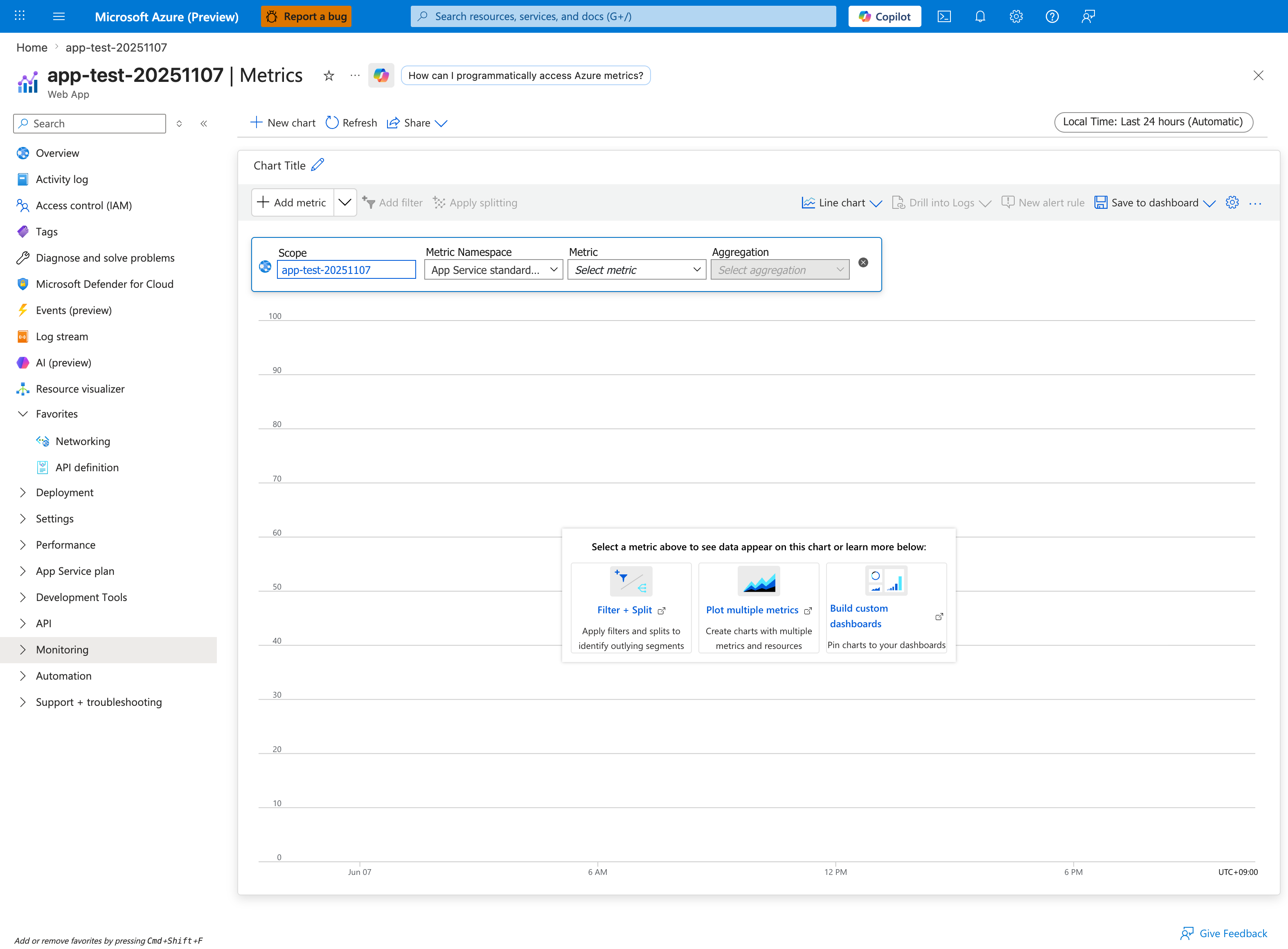
This is the starting point when no metric is selected. For performance triage, choose App Service Plan scope rather than the app scope, then add CPU Percentage and Memory Percentage and switch the time range from the default Last 24 hours to a tighter window (e.g. Last 1 hour or the exact incident window). Use Apply splitting by Instance to surface single-instance saturation that the plan average would otherwise dilute. The App Service standard metrics namespace shown in the dropdown is the correct one - do not pick Storage or guest-OS namespaces here.
- Good signal: CPU and memory mostly stable, no sustained saturation during incident.
- Bad signal: CPU consistently above ~80-90% or memory high/flat with no recovery.
Step 2: Check HTTP error-rate spike (5xx)
Confirm whether performance complaints are tied to server-side failures. - KQL (Log Analytics):
AppServiceHTTPLogs
| where TimeGenerated > ago(1h)
| summarize Total=count(), Errors5xx=countif(ScStatus >= 500), ErrorRate=100.0 * countif(ScStatus >= 500) / count() by bin(TimeGenerated, 5m)
| order by TimeGenerated asc
- Good signal: 5xx rate near baseline, no sustained spike.
- Bad signal: sharp 5xx rise aligned with latency complaints.
Step 3: Check response-time distribution (P50/P95/P99)
Average latency can hide tail-impact incidents. - KQL:
AppServiceHTTPLogs
| where TimeGenerated > ago(1h)
| summarize P50=percentile(TimeTaken, 50), P95=percentile(TimeTaken, 95), P99=percentile(TimeTaken, 99), Count=count() by bin(TimeGenerated, 5m)
| render timechart
- Good signal: P95/P99 proportional and stable.
- Bad signal: P99 diverges sharply while P50 stays normal (queueing/contention/dependency symptoms).
Step 4: Check recent restart activity
Restarts can look like random latency/error bursts. - KQL:
AppServicePlatformLogs
| where TimeGenerated > ago(6h)
| where OperationName has_any ("restart", "Restart", "ContainerRestart", "stop", "start", "fail")
| project TimeGenerated, OperationName, ContainerId
| order by TimeGenerated desc
- Good signal: no restart cluster during incident window.
- Bad signal: frequent restart/start-fail loop matching error spikes.
Step 5: Check recent deployments or config changes
Many regressions begin right after image/config updates. - Portal path: App Service -> Deployment Center -> Logs and App Service -> Configuration -> Last modified - Azure CLI examples:
az webapp deployment list-publishing-profiles --resource-group "$RG" --name "$APP_NAME"
az webapp config appsettings list --resource-group "$RG" --name "$APP_NAME"
- Good signal: no impactful change near incident start.
- Bad signal: incident starts immediately after deployment or critical setting change.
Step 6: Check SNAT Port Exhaustion detector
Performance incidents often mask outbound connection pressure. - Portal path: App Service -> Diagnose and solve problems -> Availability and Performance -> SNAT Port Exhaustion - Good signal: detector does not show near-exhaustion during incident. - Bad signal: near/at exhaustion with corresponding timeout growth.
Step 7: Check dependency health and timeout signatures
Differentiate app compute pressure from downstream dependency slowness. - If Application Insights exists: inspect dependency duration/failure trend in the same time window. - If not, query console timeout patterns:
AppServiceConsoleLogs
| where TimeGenerated > ago(1h)
| where ResultDescription has_any ("timeout", "timed out", "connection refused", "ENOTFOUND", "ECONNRESET")
| project TimeGenerated, ResultDescription
| order by TimeGenerated desc
- Good signal: no dependency timeout burst.
- Bad signal: repeated downstream timeout/connection errors aligned with latency spikes.
Step 8: Correlate per-path hotspots quickly
Identify whether a small set of endpoints is driving the incident. - KQL:
AppServiceHTTPLogs
| where TimeGenerated > ago(1h)
| summarize AvgTime=avg(TimeTaken), P95=percentile(TimeTaken, 95), Count=count(), Errors5xx=countif(ScStatus >= 500) by CsUriStem
| top 20 by P95 desc
- Good signal: no single path dominates tail latency.
- Bad signal: specific endpoints show extreme P95/P99 or elevated 5xx.
Decision Points
After these checks, you should be able to: - Narrow to 1-2 hypotheses: - CPU-bound: sustained CPU saturation with broad latency increase - Memory-bound: high memory pressure plus restart/worker degradation patterns - Dependency-bound: timeout-heavy console/dependency signals with normal CPU- Select immediate direction: - CPU-bound -> scale up and profile hot paths - Dependency-bound -> dependency/network playbook - Memory-bound -> memory pressure playbook
Next Steps
- Slow Response but Low CPU
- Memory Pressure & Worker Degradation
- Intermittent 5xx Under Load
- SNAT or Application Issue?